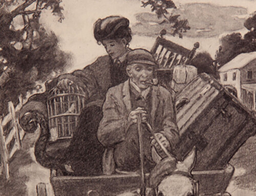
Unsigned
Ault & Wiborg Printing Inks, c. 1900
Advertising illustration for The Ault & Wiborg Co.
In 1878 the Ault & Wiborg Company was established in Cincinnati, Ohio specializing in manufacturing printing inks, dry color dyes, and pigments. In the mid-19th century English and German chemists began experimenting with creating colorants derived from coal-tar chemicals. So successful was this company in the use of coal-tar dyes to produce bright colored inks that beginning in the 1890s they began to place full page color ads in the print trade magazine, The Inland Printer and in other trade periodicals like The Engraver and Printer, and The American Printer. Not only were these ads typically designed by leading illustrators, the impressive images were made to showcase the firm’s range of colored inks. By the turn of the 20th century Ault & Wiborg was one of the world’s largest ink suppliers with offices also in New York, Chicago, St. Louis, Buffalo, Philadelphia, San Francisco, Toronto, Havana, Mexico City, Buenos Aires, London, and Yokohama.*
I have always been partial to the wonderful pattern of the above illustration’s composition. Look closely and you will see that it is composed of the repetitive forms of a gold-colored fountain pen nib, alternately arranged pointing up and down. Each nib is surrounded by the rich blues and reds of Ault & Wiborg inks.
Many of Ault & Wiborg’s ads were the work of illustrator Will Bradley and were American examples of the art nouveau style influenced by the work of English illustrator Aubrey Beardsley’s sinuous style. One of my favorite aspects of these advertisements is the inclusion of the notation of the ink colors used in the illustration at the bottom of the page for many of these pieces. In keeping with the product being advertised, Will Bradley created color-rich illustrations in a limited palette, as seen below. This ad was produced in a variety of color combinations: brown and olive; deep olive green and brilliant scarlet lake; and bronze brown and green lake. Notice how each color combination causes the image to read just a bit differently between the foreground and the background the same way the contrasting color used for the capitol letters in the text panel pop or recede the rest of the colored text.


Will Bradley (1869-1931)
Ault & Wiborg Printing Inks, c. 1895
Advertising illustration and popular poster for the Ault & Wiborg Company
Eventually Ault & Wiborg commissioned Oscar Binner of Binner Engraving in Chicago to design a series of ads called the History of Art and Illustration series focused on the history of illumination. Still meant to showcase the company’s inks and to be instructive, these sumptuous ads reflect the style and taste of different places and periods in the history of decorative arts. The written history notations were included in the lower margin to the left and pendant to the listing of ink colors used to the right.


Binner Engraving Co., Chicago
Ault & Wiborg ads, 1899 (fr. left to right: Celtic 7th c. The Book of Kells of Irish and Anglo-Saxon illumination; Roman 8th c., vol. by Sylvester, Paleography of All Nations; Japanese 6th c. manuscript style)
So popular were all these advertising illustrations that overwhelmed with requests for copies, in 1902 Ault & Wiborg published them in a Poster Album book.
February 9, 2012
By Joyce K. Schiller, Curator, Rockwell Center for American Visual Studies, at the Norman Rockwell Museum
For a wonderful overview of the company and their colorful ads see the two postings on Codex99, https://www.codex99.com/design/68.html and https://www.codex99.com/design/67.html
Otherwise for more information on Ault & Wiborg see, https://www.colorantshistory.org/AultWiborg.html