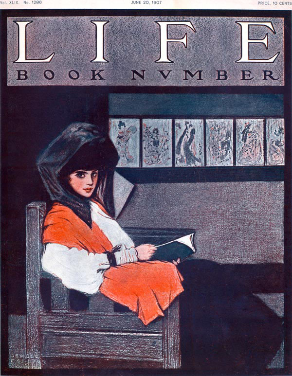
Sewell T. Collins, Jr. (b. 1876)|Visiting an exhibit of Japanese prints, 1907|Cover for Life (June 20, 1907)
I have not been able to discover much about Sewell Collins, the illustrator of this ‘book number’ cover for Life magazine from 1907: he lived and worked in Chicago at least during the 1890s, and as this cover illustration shows, he also did work for New York concerns. From its inception in 1883 through its acquisition by Henry Luce in 1936, Life was known as a humor and general interest weekly magazine.
For this cover, Collins’ created an image of a beautiful and decorous young woman seated amidst a gallery display of Japanese prints. As she looks out of the picture, she holds an open book in her hands. She is still wearing a veil or scarf over her hat and a striking orange velvet shawl over her shoulders. Because she looks out of the picture, as though the viewer has interrupted her perusal of her book, she engages the viewer with her forthright stare.
Even if we did not have the date of the magazine cover to assist, we might easily determine the time frame of the picture due to the plain, chunky design of the arm chair in which the young lady sits. It looks like a piece of mission oak furniture, popular in the early 1900s and part of the American Arts and Crafts movement. This style of furniture was made of wood joined in simple, linear forms. Leading examples of this style were produced by the Arts and Crafts designer Gustav Stickley and his brothers, L. and J. G. Stickley among others. In Chicago, the Arts and Crafts aesthetic was a bit chunkier and more block-like and similar to the chair we see in Collins’ Life cover illustration.
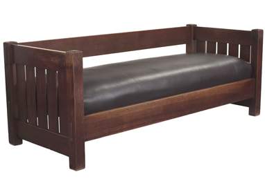
A similar looking settle by Gustave Stickley
So what can we say so far about Sewell Collins’ illustration? That he pictured a contemporary scene. The young lady, dressed with a full sleeved shirt-waist blouse with tightly fitted cuffs, is wearing the latest fashion from the first decade of the 20th century. Her skirt is black. The bit of black around her right wrist is most likely the handle of her reticule, a woman’s small drawstring handbag.
But what is most striking about Collins’ illustration, is the row of Japanese prints that line the wall behind the young lady. The six print images we see all appear to be of the ukiyo-e type, that is “pictures of the floating world,” a world of fleeting beauty and evanescent moments popularly reproduced in prints in Japan from the 17th through the 20thcenturies. Mass-produced prints were generally collected in Japan by those who could not afford to acquire original art. In the 1890s Japanese ukiyo-e prints were also being sold to art collectors and enthusiasts in Europe and the United States.
Because these print images seem to be of beautiful courtesans, they serve as a clever juxtaposition to the pretty young lady seated in the gallery. The training of Japanese women (courtesan or not) required their movements be elegant and refined. While certain fashions may be tied to specific places and times, youthful, elegant beauty may be viewed as timeless. So the beauty in the chair and her counterparts on the wall are not so very far apart.
Another fascinating aspect of Collins’ illustration, is the arrangement of the Japanese prints on the gallery wall. They are hung on the line, meaning that they march along the wall all on the same invisible line. This was a very “modern” way of installing art and was introduced by the American ex-patriot artist, James A. M. Whistler. From the way the wall reads in the illustration, it appears that they are in fact resting on a dark stained piece of molding, instead of being framed individually. The ledge molding seems to match the baseboard molding at the bottom of the wall.
Remarkably, earlier this same week in 1907, there was an article in the New York Times about the Art Institute of Chicago’s creation of a new print room in its public galleries.** The article not only chronicled the rooms inaugural installation of Whistler etchings, but it also described the walls of the space as being covered “. . . with Japanese grass-cloth.” The walls of Collins’ illustrated gallery too seem to be covered with a soft fabric of some sort. This was a convention popularized during this period, especially in spaces where there were changing installations of art. The fabric covered walls easily disguised the growing abundance of nail holes as art was hung and re-hung in a gallery space.
As for the book aspect of this illustration, according to my research, at least five books on Japanese prints were published in New York City in 1907.
* The title of this week’s posting, “Girlish Glee” is taken from a Gilbert and Sullivan song, “Three Little Maids” written for their opera, The Mikado. For some reason the young American woman and her Japanese ukiyo-e counterparts brought to mind that song.
** “Current Art Matters at Home and Abroad” The New York Times (Sunday June 16, 1907): part ix Second Magazine Section, page SMA6.
May 20, 2010
By Joyce K. Schiller, Curator, Rockwell Center for American Visual Studies
at the Norman Rockwell Museum


