C. Coles Phillips (1880-1927)
Holeproof Hosiery, c. 1920s
Advertising illustration for Holeproof Hosiery Company
Seeing a woman’s leg from her ankles to above her knees was once a rather daring notion. In the early 1920s, illustrator C. Coles Phillips was producing advertising illustrations for the Holeproof Hosiery Company of Milwaukee, Wisconsin. These ads featured scantily clad woman wearing silk stockings visible from her feet to above her shapely knees. While these advertising illustrations were meant to entice women to purchase the light-weight, durable Holeproof product, Coles Phillips often layered his illustrations with other symbols and visual references.
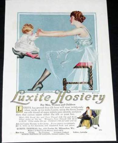
In the teens, before Phillips created advertising illustrations for Holeproof Hosiery, he produced advertising illustrations for “Onyx” Hosiery and for Luxite Hosiery. As we will see, his Luxite images (see below) heralded the symbolic references he would employ in his later Holeproof ads.
C. Coles Phillips (1880-1927) C. Coles Phillips (1880-1927)
Luxite Hosiery ad, 1918 Holeproof Hosiery ad, 1924
https://www.vintageadbrowser.com/
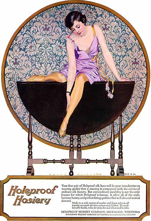
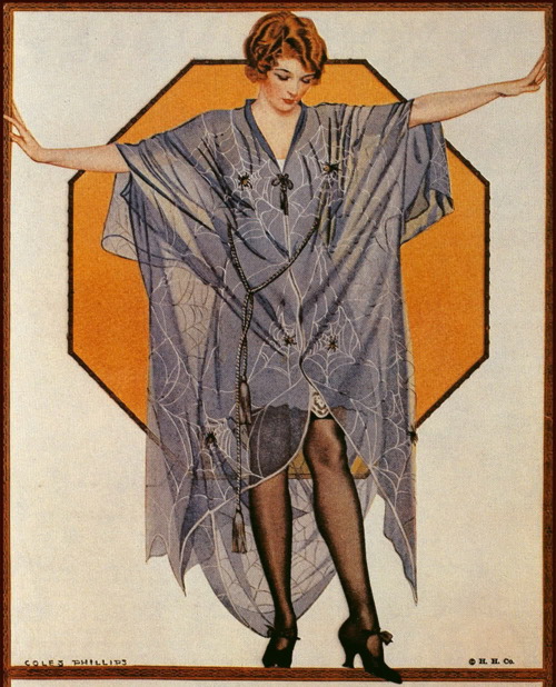
The earlier Luxite ad is done in his signature fade-away style with the background and some elements of the woman’s clothing produced in the same color. This fading-away of certain areas of the woman’s form allowed Phillips to suggest the figure’s body via various details. So while the woman’s skirt and part of her bodice fade into the background, her black stocking clad legs stand out within the image. So too do the dark turned wood legs of the bench the woman sits on stands out against the blue. The ornamental spiral turning of the bench’s legs are a reminder that a woman wearing Luxite or Holeproof Hosiery seated on a partially closed gate-leg table (see above) reveals a well-turned shapely leg.
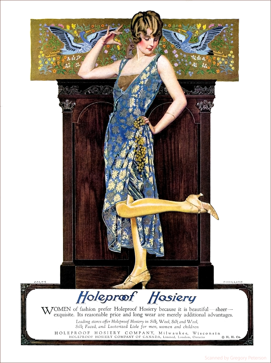
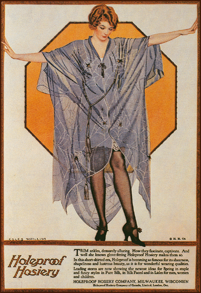
In the 1923 Holeproof Hosiery ad above, Phillips’ comparison is the lightweight thinness of the hose as compared to birds flying around the lady’s head
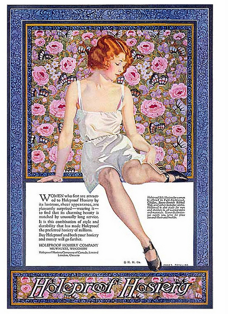
The visual puns of the Coles Phillips’ ad illustration seen at the beginning of this piece reveals a multi-layered image. The beautiful woman of this illustration uses the wood-like framework Phillips painted surrounding the ad and dividing the image from the ad’s text, as though it were a stage. She poses with her hands extended to the ‘wood’ edge with the index finger of her right hand painted over the framework and her left foot extending beyond the stage on which she stands. This is clearly a bit of trompe l’oeil folderol. Behind the model is an octagonal shape colored a yellow orange inside its black edge. In the early part of the 20th century, highway road signs were devised at the whim of the automobile clubs that promoted and maintained the roads. In 1923 the Mississippi Valley Association of State Highway Departments developed an influential set of recommendations about street-sign shapes. In 1927 the American Association of State Highway Officials published a manual and specifications for standard traffic signs, signals, and markings. Coles Phillips’ octagonal yellow sign [above] is reminiscent of what was originally used as the color of a stop sign.* If it was meant that way, then Phillips’ illustration in an elemental way calls to the magazine reader to stop and pay attention. Indeed even the woman’s extended hand gesture mimics the hand-stop signal of a policeman.
What we are called to stop and pay attention to, is the gossamer fabric of the woman’s kimono—so sheer that we can see the stop sign painted behind the fabric. The implication is clear, Holeproof Hosiery are as sheer as the fabric of the lady’s kimono. And the patterning Phillips painted on the kimono fabric are various sized spider webs each with its own spider poised in the center of their web. These webs are strongly woven from the thinnest material, spider silk.
C. Coles Phillips (1880-1927)
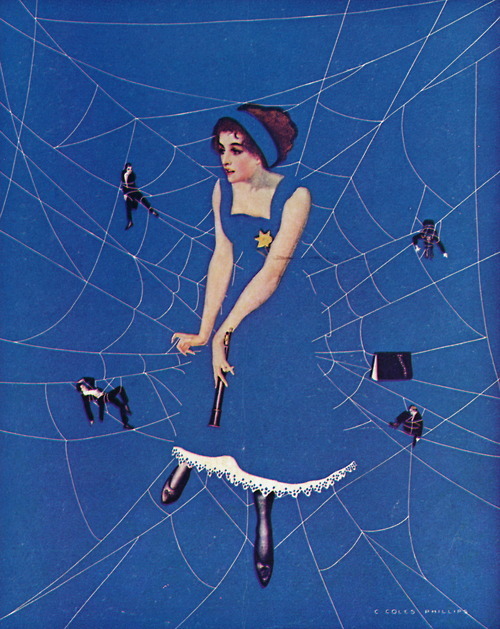
Net Results **
Cover illustration for Life magazine (August 21, 1911)
A decade before, Coles Phillips painted a Life magazine cover fade-away illustration of a beautiful woman seated at the center of her own web (see above). Dangling from the gossamer threads of her web are four tuxedo-clad entangled gentlemen and a little black book resting on another thread near her. Ignoring the men she has already caught in her web, the lady holds an open spy glass in her left hand as she awaits more interlopers. Phillips called this illustration Net Results.
The net result of Holeproof Hosiery, Phillips contends in his advertising illustration, is that men can be caught by the sturdy but fragile looking hose-covered legs when women wear this brand.
Oh what a web women weave.
* Hilary Greenbaun and Dana Rubinstein, “Who Made That?: The Stop Sign Wasn’t Always Red,” The New York Times Magazine (December 9, 2011). In 1935 the Manual on Uniform Traffic Control Devices “recommended a yellow stop sign with black letters. The 1954 revision, however, called for the stop sign to be red with white letters.”
** In terms of visual influence, look at this illustration for sheet music (below) for a George Gershwin tune called “When You Want ‘Em You Can’t Get ‘Em,” produced by the Rosenbaum Studios in 1916.
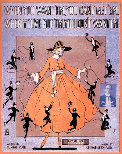
If your want to hear “When Your Want ‘Em,” and see a larger image of the sheet music cover, go to, https://perfessorbill.com/covers/whenuwnt.htm
September 19, 2013
By Joyce K. Schiller, Curator, Rockwell Center for American Visual Studies, Norman Rockwell Museum