 Charley Harper (1922-2007)
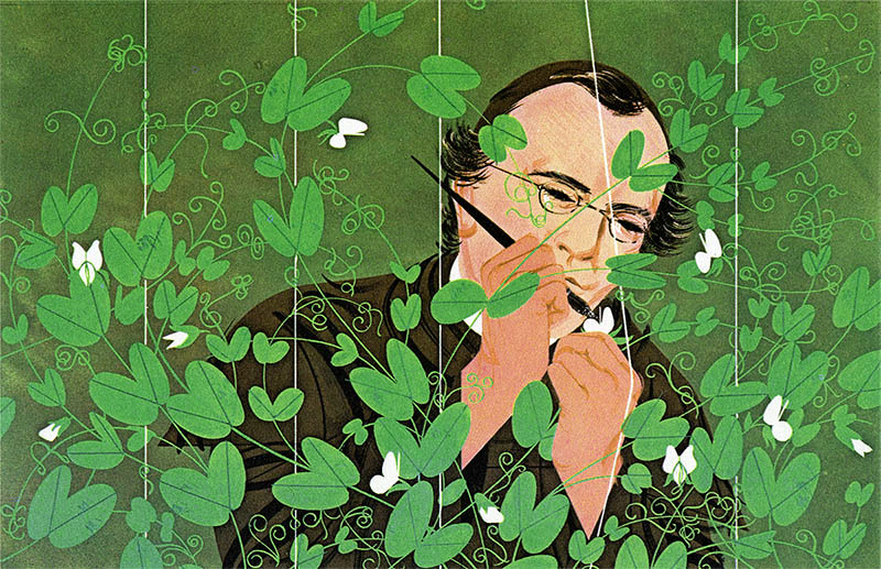
Gregor Mendel Transferring Pollen from One Flower to Another, 1961
Illustration in The Giant Golden Book of Biology (Golden Press, 1961)
In Charley Harper’s Gregor Mendel Transferring Pollen from One Flower to Another created to illustrate the portion of the Book of Biology text that deals with DNA, genetics, and inherited traits, his rather flat technique serves the story well. Mendel’s work pioneered this field of science through his cross-pollinating of pea plants, using the pollen of a different strain of pea flower to fertilize another strain, creating entirely new kinds of pea plants in the process. This particular illustration shows Mendel delicately using a brush to place foreign pollen into a specific strain of pea flower, gently pulling the plant away from the strings that guide its upward growth. This piece directly contrasts man (or the human influence, guiding hand, and the rigid structure of science), against the wild, seemingly untamable chaos of nature.
This juxtaposition of man and nature is not just a contrast of subject matter, but a contrast of visual style, line weight, mass, and the directionality of line. In the background, we have the singular human figure of Gregor Mendel, rendered in a style which relies heavily upon the distribution of large shapes or masses of color and wisp-like brush strokes (or lines) to create a sense of dimensionality, and indication of form. In the middle ground, Harper placed five white vertical lines which jump forward in the picture plane, visually serving as the strings that help guide the growth of the pea plants. All are thin, rigid, uniform, and evenly placed. All but the one string which is slightly bent due to Mendel’s hand grasping the pea plant it supports. In the foreground, however, is where all chaos breaks lose. The foreground is a giant, curly tangle of pea plants, their new growth spindling into decorative curves, and both the flowers and leaves of the plants themselves are incredibly graphic (flat) shapes of color with slight acrylic textures, and very geometric, straight lines to denote the vein down the center of each leaf. The growth of these pea plants arc around the foreground, likely to guide your eye amidst the chaos back to Mendel and his hand, but their bending and curvature act as a stylistic contrast to Mendel, the world of men, and rigidity of the scientific method.
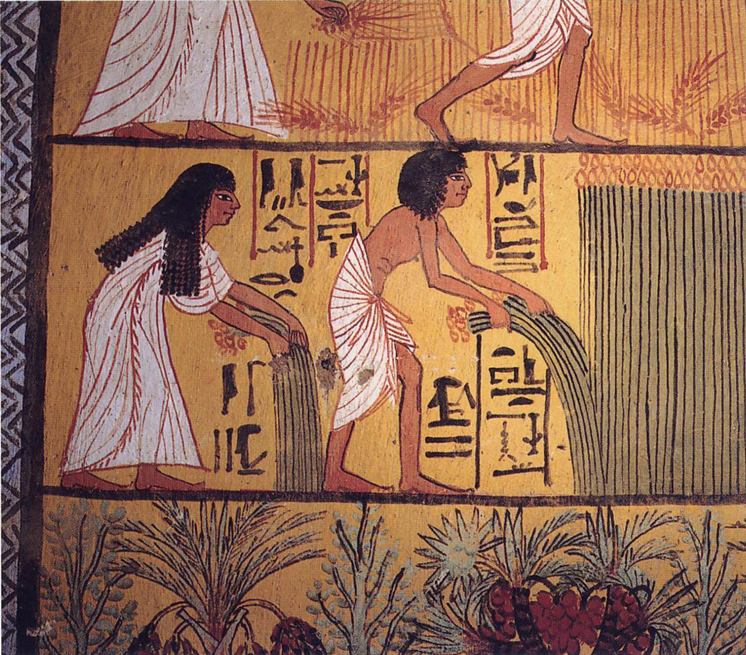 Sennedjem and Ti harvesting papyrus, Ramesside Period (13th to 11th c. B. C.)
From a mural painting in the Tomb of Sennedjem in Deir el-Medina, Egypt
The usage of foliage in narrative art is nothing new – it’s been around since ancient times and many a Egyptian tomb wall has featured palm fronds and papyrus plants (see above). However, the usage of highly graphic, simplified, shape-based plant-matter dominating the foreground of an illustration which acts as both a framing and decorative element, was a visual motif found throughout the 1960’s.
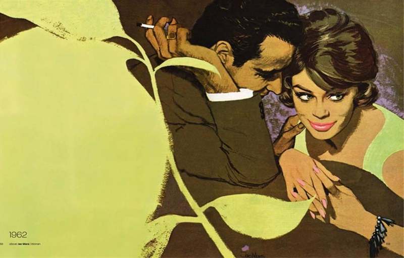
Jac Mars (1919-1992)
Illustration for Woman (1962)
The British illustrator Jac Mars utilized a massive piece of foliage to frame a moment between a woman and the man who loves her in a lifestyle illustration for a 1962 issue of Woman magazine. He tied the colossal, pistachio colored mass of greenery to the rest of the piece by repeating its color in the woman’s dress and eyes. However, by choosing to place a bright smack of hot pink upon her lips, a rubbing of a medium-value violet behind the woman to silhouette her in the space, and a bright white value for the whites of her eyes, your attention goes directly to her, not to the greenery that surrounds her and dominates the picture frame in terms of size-dominance. He utilized value and color contrast to guide your eye directly to the action.
In both cases, these illustrators from the 1960s utilized their understanding of shape making to frame their work with leafy foliage. The nature of their color palettes are even relatively similar – green vs. red. However, Harper’s is more kelly green vs. a warm peach, and Mars’ a pistachio vs. a cool pink that is made warm in comparison. Harper’s work furthers the contrast between man and nature by putting their shape language of straights vs. curves, geometric masses vs. painterly brush line work against each other. You look where you need to because of stylistic contrast. Jac Mars’ piece on the other hand, allows the imposing mass of vegetation to sit within the world of his illustration a little more cohesively, placing its color in two other locations to balance it out, and forcibly introduces contrast of chroma to guide your eye to the subject matter.
December 12, 2013
Elisabeth Pulido, grad student in Illustration Practice at MICA in Baltimore