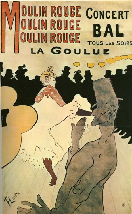
Henri Toulouse-‐Lautrec (1864-‐1901)
Moulin Rogue: La Goulue, 1891
Advertising illustration for the Bal du Moulin Rogue, Paris
Color Lithographic Poster
In 1891 Henri Toulouse-‐Lautrec created a series of promotional posters commissioned by the Bal du Moulin Rouge as advertisements for the dance hall. In the poster seen here, Lautrec limited himself to line and a few areas of flat color. He designed the lettering in the style and color of the rest of the piece, making it a complete and harmonious image. Lautrec created three layers of depth in the picture plane; the crowd (which is represented by a dark flat silhouette), the female dancer who occupies the central space of the piece and is rendered in the most detail and variation of any figure, and the gentleman in the foreground, who is defined by dark line and flat stippled grey tone. Prior to Lautrec accepting the commission for the Moulin Rogue campaign, he studied painting under the academic artist Leon Bonnat. By this time, other contemporary painters were trying their hand at commercial illustration. Indeed by 1888 Lautrec was widely known for his illustrations in the weekly Paris-Illustré and the periodical Figaro Illustré. Lautrec’s experience with and interest in the mechanical reproduction of his images showed him the efficacy of simplifying color tones and focus on the linear forms. In 1889 when Pierre Bonnard designed a poster for France-Champagne (see below), he too focused his image on a bold, graphic style. The smiling woman shown tips her head toward the viewer as she laughs and spills the frothing bubbling champagne. Compared to Lautrec’s poster, the line work is inconsistent and even clumsy and the lettering does not seem to find its place in the composition. The stylization and flattening of color and form echoes what was happening in modern painting, but the way Bonnard plays up his subject is unique to his commercial work.
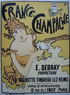
Pierre Bonnard (1867--1947)
France-Champagne, 1889
Advertising illustration for France-Champagne
Color Lithographic Poster
Other successful commercial artists, like Jules Cheret, made popular posters and illustrations reflecting colorful scenes of contemporary Parisian life. Cheret’s poster for Vin Mariani (see below) uses shaded layers of color to produce a more three-dimensional image. Compared to posters by Lautrec and Bonnard, Cheret’s shows little of the compositional or style developments in art of the moment.

Jules Cheret (1836-1932)
Vin Mariani, 1894
Advertising illustration for Mariani tonic Wine
Lithographic reproduction
When Lautrec’s Moulin Rogue campaign was launched in 1891, the artist’s designs were revolutionary in the world of commercial art, mostly because he did not change the approach or the subject matter of his personal work. Unlike Bonnard’s poster, which was designed with the intent to sell a product, it appears that Lautrec’s primary focus was to capture the world of his life, the vibrant, quirky, sometimes seedy, bohemian Parisian nightlife, with an air of detachment and understated humor. While Bonnard saved autobiographical subject matter for his painting, Lautrec boldly used his observations from life to inform both aspects of his work. For this poster, the scene is not from fantasy but a performance of the can-can dance at the Moulin Rogue dance hall that Lautrec, and any other patron of the cabaret, could experience during a night out. The characters are not wearing exaggerated expressions of joy or titillation: the performing woman, La Goulue, looks vaguely bored or as if she is thinking about something else entirely; and the man in the foreground, the amateur dancer Valentin le Désossé, with his eyes closed or perhaps looking down, obviously disengaged from the spectacle. Lautrec captured the appeal and vibrancy of Moulin Rogue nightlife without compromising the truth of his observations.
Toulouse-Lautrec’s poster illustration shows the influence of contemporary art such as portrayed by post-Impressionists and also the flat graphic pictures of Japanese woodcuts popularly seen about town. Van Gogh, Gaugin and their contemporaries tended to flatten some of the spaces and colors of their paintings. The Japanese cropped their version of flattened compositions uniquely, embracing the visual reality of seeing things incompletely at times. Lautrec was embraced by his peers as both a commercial and fine art artist, with no distinction between the two. Indeed illustration informed his paintings, and his paintings influenced his illustration. The two were as integral as his bohemian lifestyle was to the avant-garde art scene and the art he created. The art he produced was an extension of his life and a reflection of himself.
January 23 , 2014
By Ms. Sarah Schneider, graduate student in Illustration Practice at MICA, Baltimore